
I have every screen of my new product wireframed. I designed none of them manually. I can't design.
That's not false modesty. I genuinely don't have wireframing or UX design skills. Never studied it, never practiced it, never had the eye for it. For years, that gap shaped how I built software: I skipped the design phase entirely and went straight to code.
AI didn't just speed up my existing process. It gave me a capability I never had.
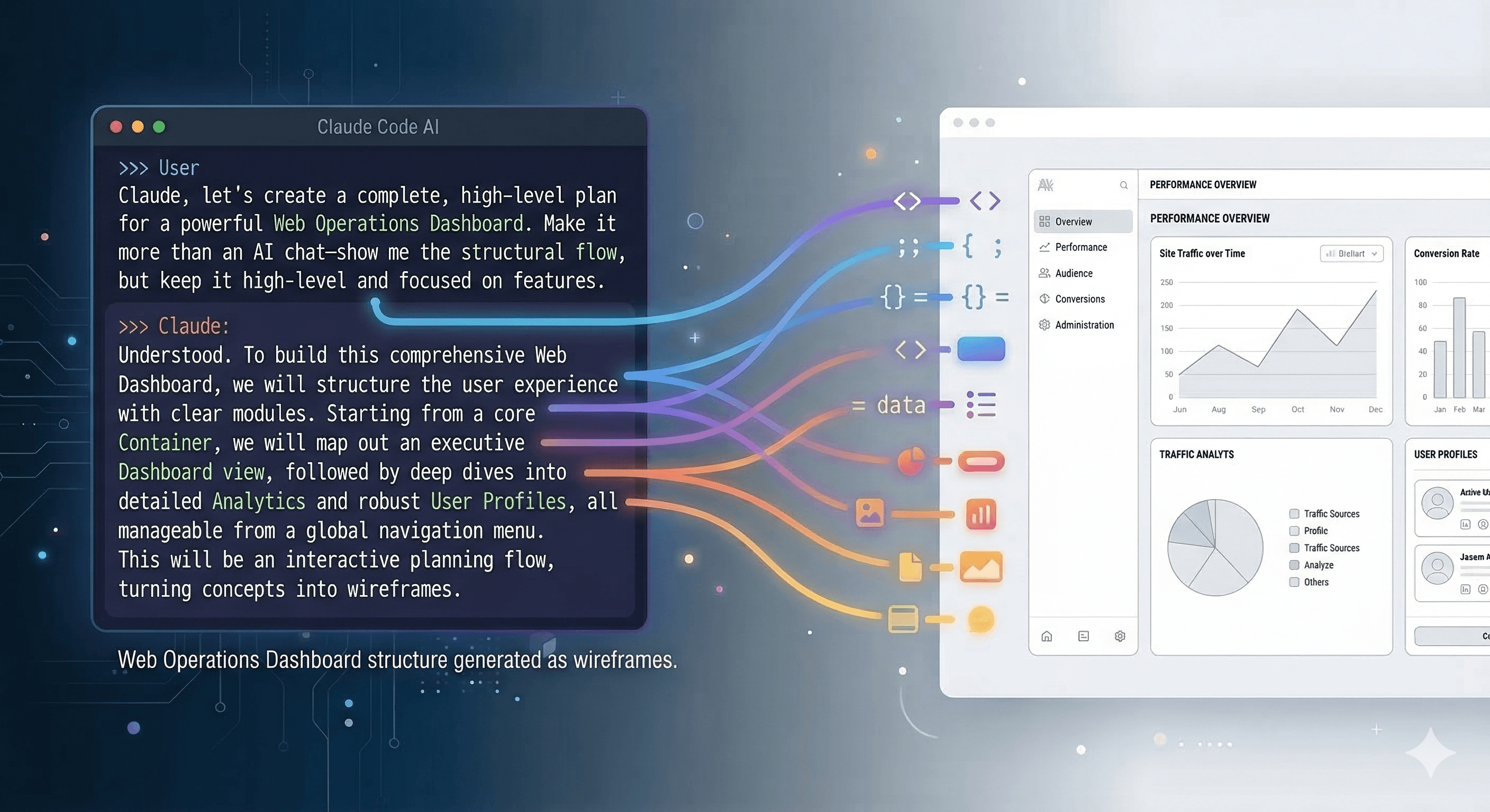
In this article:
- The old way: idea to code with nothing in between
- The reversal
- Step 1: defining the product with a PM agent
- Step 2: designing wireframes with Pencil
- Step 3: the PM reviews the designs
- Step 4: the agents brainstorm together
- What actually changed
- The skill gap insight
- What's still rough
- The tools
The old way: idea to code with nothing in between
Every product I've built followed the same pattern. Have an idea. Grab a notebook. Sketch rough boxes and arrows. Open the editor. Start coding.
Those paper sketches were private. Not because they contained secrets, but because they were genuinely bad. Crooked rectangles, illegible labels, arrows going nowhere. They helped me think for fifteen minutes, then sat in a drawer.
No specs. No user stories. No acceptance criteria. No wireframes. The overhead of doing them solo felt absurd. That's a lot of process for a team of one.
So I skipped it all. And the cost showed up later: features that needed rework, UX problems discovered in production, entire flows missed mid-sprint. The kind of problems that planning would have caught.
The reversal
With AI agents, the cost of planning dropped to near zero.
What used to take a product manager days, an AI agent does in minutes. What I literally could not do (designing wireframes), an AI agent does from story specs while I watch.
The flow reversed. Instead of idea to code, it became:
The full product development process that I'd skipped for years, suddenly accessible. Not because I learned new skills, but because AI filled the gaps.
Today I am sharing the process I followed with a product I just started, buildaloo 🐙
Step 1: defining the product with a PM agent
I start with a rough product brief and a set of personas. Nothing polished, just my thinking given to Claude Code and asked a PM agent to structure it into something real.
What came back: epics, features, and dozens of user stories with detailed acceptance criteria. Each story had:
- A priority (P0 or P1)
- A target audience (parents, kids 5-7, kids 8-12)
- Specific edge cases I hadn't thought about
For example, I knew I needed email verification. The PM agent's story included: "Signed, single-use token valid 24 hours. Expired link shows message plus resend button. Resend rate-limited to 3 attempts per hour."
Those details would have emerged eventually during implementation. But they would have emerged as bugs, not as specs.
Everything lives in markdown files, organized in a flat folder structure that I navigate with Obsidian. No Jira. No Linear. Just files I own, in a repo I control, version-controlled through Git.
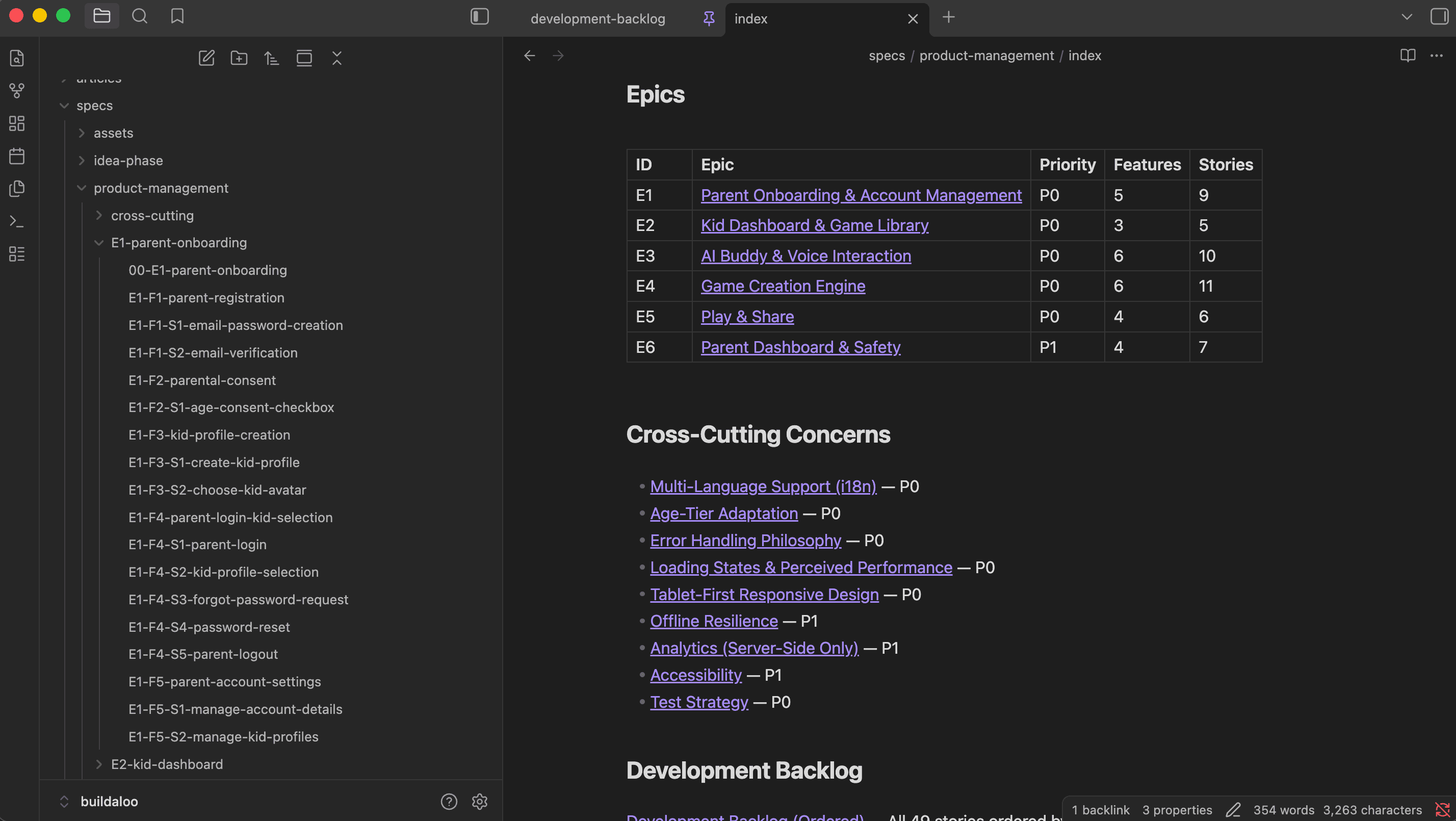
Product backlog organized as markdown files in Obsidian
The PM agent also surfaced cross-cutting concerns I hadn't considered:
- Internationalization across multiple languages
- WCAG accessibility requirements
- A tablet-first responsive strategy
- A consistent error handling philosophy
These became their own spec documents, referenced across all the stories. The kind of systematic product thinking that's easy to skip when you're eager to start coding.
Step 2: designing wireframes with Pencil
This is the part that changed everything for me.
Claude Code connects to Pencil through MCP, the Model Context Protocol. Pencil is a design tool, like a lightweight Figma, that exposes its canvas through an API. Claude Code can read the design file, insert frames, create components, set styles, generate images, and take screenshots to verify what it built.
The workflow:
- The agent reads the story specs and understands the acceptance criteria
- It sets up design system variables (colors, typography, spacing, border radii) from my design system document
- It builds reusable components: buttons, input fields, chat bubbles, game cards, navigation headers
- It assembles full screens using those components
In one session, it produced dozens of screens covering all priority-zero stories, with design tokens and reusable components. Screens organized in labeled rows on the canvas with engaging illustrations.
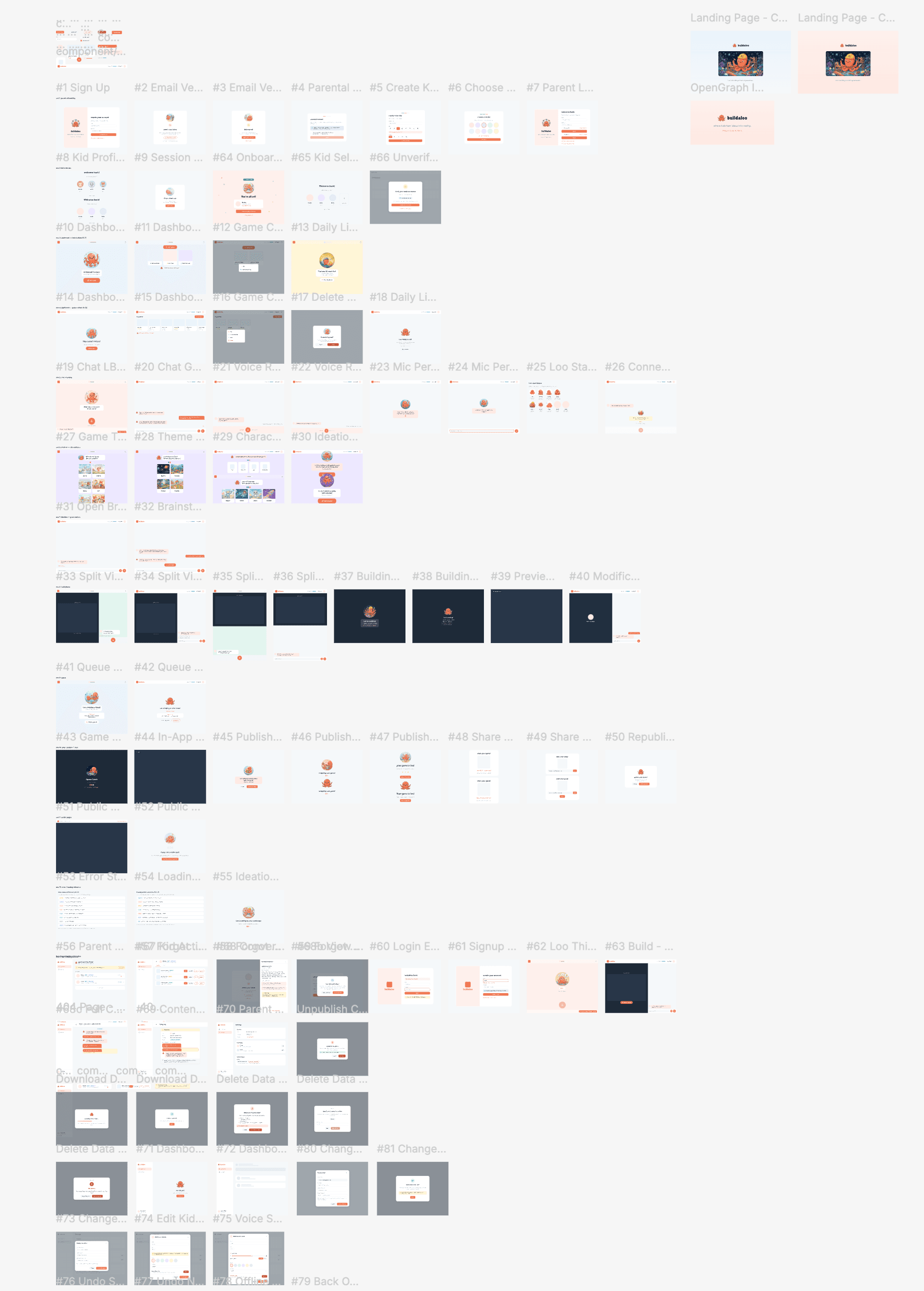
The Pencil canvas with all wireframe screens organized by flow
These aren't rough sketches. They're structured design files with proper layout hierarchy, consistent spacing, real typography, and AI-generated placeholder illustrations for the mascot character.
I can open the file in Pencil, zoom into any screen, inspect the layers, and edit anything. Or better, ask the agent to adjust them as I wish.
I described what I needed in conversation. The agent produced screens I could immediately review and iterate on. A capability I never had.
This isn't just for new products
The same process works when you already have a product with an established design.
For Materiality Master, I needed to design a new survey management feature. The agent was already connected to the codebase, so it understood my existing design system: the navigation patterns, the component library, the color scheme, the layout conventions.
I gave it a few screenshots of existing screens as reference. From there, it produced wireframes that looked like a natural extension of the product. Same sidebar, same tab patterns, same card styles. Survey settings, question builders, respondent dashboards, all consistent with what was already shipped.
The difference from building a new product: the agent doesn't invent a design language. It reads yours from the code and matches it. New screens that look like they were always part of the product.
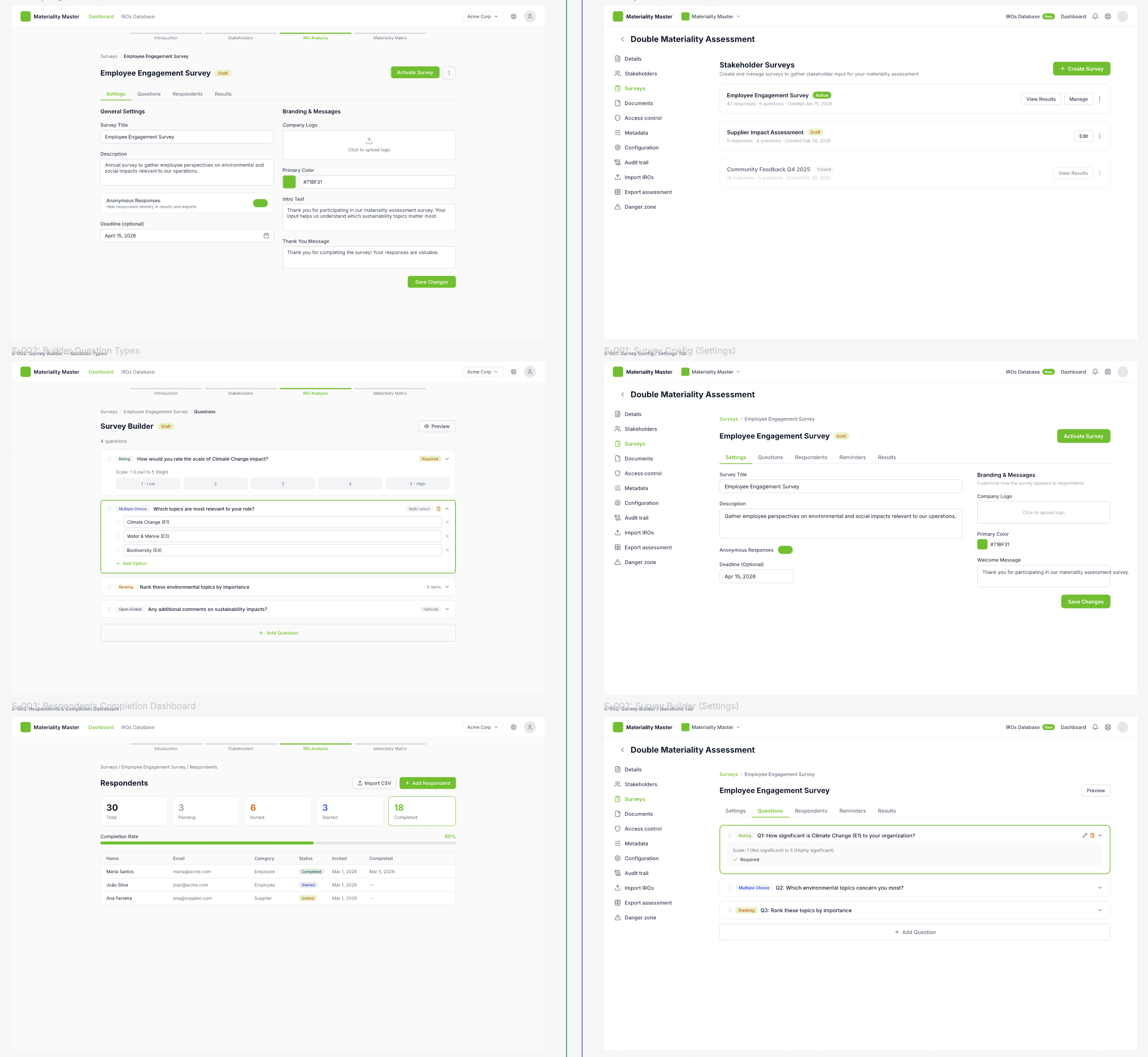
New survey management wireframes for Materiality Master, matching the existing product design
Step 3: the PM reviews the designs
I didn't just accept the designs. I launched a PM agent to review every single screen against the acceptance criteria from the stories.
The PM agent went through all stories, checked which criteria were visually represented, and flagged what was missing:
You have zero parent-facing screens after onboarding. The parent share notification story is priority zero and requires a parent dashboard that does not exist in the designs.
The game loading screen includes a gradient progress bar. The cross-cutting concerns document explicitly says no percentage bars. This violates the design principle.
No Loo thinking indicator shown in any chat screen. The spec requires a typing indicator before the first word of streaming. Without it, kids will think Loo is ignoring them.
From those findings, the PM and UX agents worked together to produce a structured plan. The output was remarkably organized:
- A phased screen plan mapping every new screen to its corresponding user story
- Key design decisions born from the collaboration: voice settings nested inside kid profiles, undo driven by voice instead of UI buttons, offline banners that push content down rather than overlay it
- Open questions for me that only a human could answer: how many predefined avatars? What age is the tier boundary? What's the free plan daily limit?
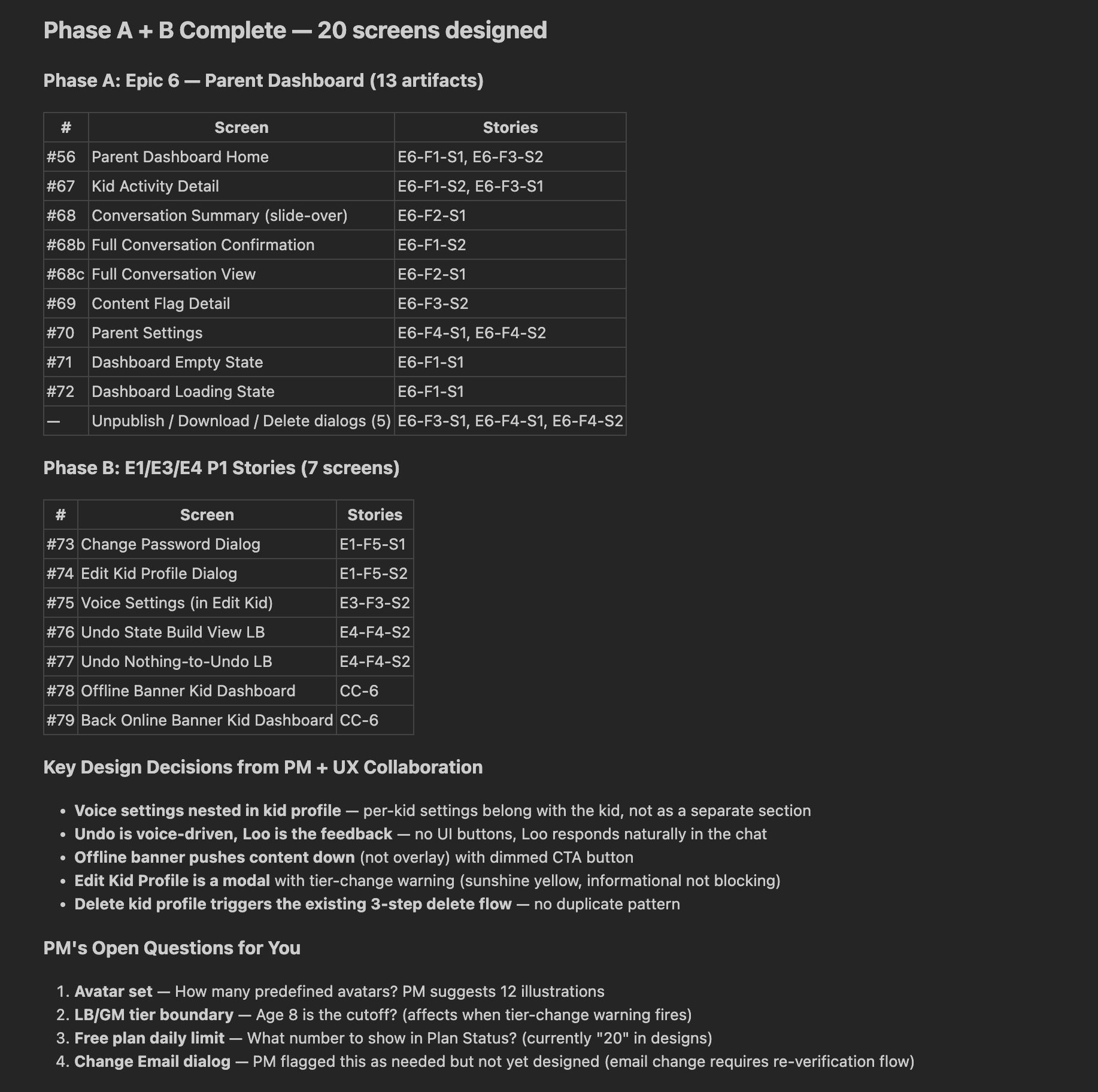
PM and UX agents collaborating: screens mapped to stories, design decisions, and open questions for the human
The agents handled the structured work. They surfaced the decisions that actually needed me. That's the kind of review I would never have done on my own because I would have been too eager to start building.
Step 4: the agents brainstorm together
This was the moment I didn't plan.
I was looking at screens, and something felt wrong. They were too complex for my targeted users.
Instead of trying to fix it myself, I launched two specialized agents in parallel: a UX Designer and a Product Manager. Both received the same context: my concern about voice-first design for pre-literate kids. Both independently analyzed the problem.
They converged on the same diagnosis:
We wrote voice-first in the spec but designed text-with-voice-added. Those are two fundamentally different products for a five-year-old.
The UX Designer proposed transforming the experience from a chat interface into "Loo's World," an animated stage where the mascot is a large central character, not a small avatar in a chat bubble.
One rule from the PM stuck with me. The Zero-Text Test:
Cover all text with your hand. Can the child still complete the task? If no, redesign until the answer is yes.
From their analysis, I made four concrete decisions:
- Reduce game types from six to four for young kids
- Keep minimal chat history instead of removing it entirely
- Use voice-only retry when the microphone is denied instead of showing a text input
- Use color-coded background zones so kids associate each screen type with a color instead of reading a label
The agents then redesigned those screens:
- Selection cards went from six text-labeled options to four illustration-dominant cards in a 2x2 grid, with single-word labels like "Jump," "Catch," "Race," "Art"
- The chat layout transformed from a message thread to a center-stage Loo character with a hero-sized mic button
- Each screen type got its own background color: sky blue for dashboard, peach for conversations, purple for ideation, mint for building
What actually changed
Catching problems before code. The voice-first gap, the missing parent dashboard, the progress bar that violated design principles. All caught in design review, not in production. The cost of changing a wireframe is zero. The cost of changing a shipped feature is not.
Having something to show. For the first time, I have real wireframes. Dozens of screens with consistent styling, proper layout, and AI-generated illustrations. If I needed to bring on a co-founder, an investor, or a contractor, I have something concrete to share.
Better product thinking. The PM agent asks questions I forget to ask:
- "What happens when a kid's session expires mid-build?"
- "What does the daily limit look like at three remaining versus zero?"
- "Where does the publish button live in the build phase?"
These would have become bugs. Instead, they became design decisions.
The design system is enforced. Colors, typography, spacing, all set as variables from the start. Every screen uses the same tokens. Consistency baked into the tool, not documented in a PDF that nobody reads.
The skill gap insight
Most discussions about AI and productivity focus on speed. "AI makes you 10x faster." Maybe.
But speed improvements on tasks you could already do are incremental. The transformative change is when AI gives you capabilities you didn't have at all.
- I could not design wireframes. Now I have my full product designed before developing.
- I would not have written detailed acceptance criteria for a solo project. The effort-to-value ratio didn't make sense for one person. With AI, the effort dropped so low that the value became obvious.
- I would never have run a structured design review, had two agents brainstorm a redesign, or iterated on a voice-first model with a UX researcher's perspective.
AI didn't make me a faster developer. It made me a developer with a product team.
What's still rough
Creative decisions need human judgment. The agent applied lowercase to proper names because the design system said "all labels lowercase." It designed a chat-centric interface for pre-literate kids because the spec said "chat" and it followed the spec literally. Every one of these was caught and corrected. You can mitigate some of this by running multiple review cycles with different specialized agents, but the human still needs to be in the loop for creative and strategic calls.
The tool has quirks. Multiple image generation calls in a single batch sometimes fail and need to be split. Some component overrides affect the source instead of the instance. Workflow friction, not blockers.
Garbage in, garbage out. The wireframes were good because the stories were detailed. Vague brief, vague screens. The difference is that writing good specs with AI help is also dramatically easier than writing them alone.
The tools
- Claude Code - the AI agent that orchestrates everything, reads specs, launches sub-agents, and drives Pencil via MCP
- Pencil - design tool connected via MCP that produces real, editable design files with components, variables, and layout hierarchy
- Obsidian - for navigating the markdown spec files and product backlog
- Specialized agents - PM agent for story definition and design review, UX Designer for screen creation, both launched as sub-agents from Claude Code
The pattern continues
It started with daring to let an AI agent code autonomously. Then it was giving that agent a full review team. This time, it's: let your agent plan and design the product before any code exists.
Each step follows the same trust ladder. Skepticism, a small experiment, results better than expected, expanded scope. Not deeper into code, but outward into product management, UX design, and creative direction. If you want to see the breadth of what becomes possible, I covered dozens of use cases in a previous article.
The solo developer's superpower in 2026 isn't writing code faster. It's having a full product team that runs from a terminal window.
I still make every decision. I still review every output. But I'm no longer limited to the skills I personally have. I'm limited only by the questions I think to ask. And with the right agents, even the questions get better.
If you're curious about the product itself, buildaloo is built for kids. My daughters already build their own games with AI agents, and buildaloo is what grew out of watching them. Every wireframe described here is in service of making that experience better for children who can't read yet but have no shortage of imagination.
A special thanks to Joao Camarate for sharing his process and how he approaches design-first development on his own projects. Seeing his workflow firsthand inspired me to adopt these best practices and apply them to my own products.